Wednesday, 30 September 2015
Front Cover of Magazine
I have learnt a lot and one main thing is how to use Photoshop to produce the magazine.
I mainly used Photoshop to produce this magazine.
I have used all the conventions. Language is used by the focal point of the cover image, ideology is the plain white background i have used as it was plain and simple and would help express the writing, institution is shown as it is a college magazine and is shown by the books/folders being help with the typical college boy with the lovely glasses as the main image of the front cover and the audience is clearly shown for college students and finally the representation is the college themed magazine.
I would make the writing more clear for the other headlines and the title and put it mainly all on one line for the main heading.
Monday, 28 September 2015
Saturday, 26 September 2015
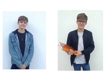
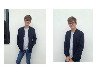
Photographs for Front Cover
The reason for why i have chosen these ideas for my front cover is because they show a typical college student, with the plain background and some books/folders to show the work that is made during college hours, i have also added the student using some earphones as sometime you normally see the college students walking around.
Mise-en-scene and Location ideas
Ideas:
- School
- College
- Field
- Gym
- Theater
- Music Classroom
- Recording Studio
- Canteen
- Library
- Science Lab
- Subject Classrooms e.g. Maths, English
- Playground
- Books
- Folders
- Stationary
- Science Equipment
- Music Instrument
- Music Head-phones
- Sports Equipment e.g. Football, Rugby ball, Rackets
- Camera (photography)
Tuesday, 22 September 2015
Monday, 21 September 2015
Mood Board
The reason why i have picked these for my mood board is because these are the main things that the younger generation and teens are into. This is because they are very up to date and have different meanings for different people. It could be hobbies for some and an interest for others etc.
Saturday, 19 September 2015
Feature Story Ideas
Main Story Ideas:
- 'Dramatic increase in the much coveted A* grade'
- 'A Perfect Year!'
- 'Rob Aramayo cast in HBO drama'
- 'Wyke college students celebrate Biology success'
- 'Wykes magnificent seven'
- 'The Wyke election 2015'
- 'RAG Week!'
- 'Charity work'
- 'Frantic assembly'
- 'Another outstanding year!'
Magazine Names
Different Names:
- College
- Student
- Sportz
- Music
- Alive
- Drama
- Theater
- Musical
- Studies
- New Start
- Que
- Freedom
- Fashion
- Science
- Graphics
- 'Ology'
- Stylish/Style
- Hard-work
- The name of the college, e.g Wyke
- Results...
Friday, 18 September 2015
Colour Schemes
The reason for why i picked theses colors are because they are simple and quite bright which will help my magazine be more successful as is will attract others for buying my magazine.
Thursday, 17 September 2015
LIIAR Analysis: Unicorn Advert
Languge:
- The main focal point of this advert is the Unicorns nose/muzzle, it draws the attention to the mint.
- It also shows, a seen to be, woman holding and giving the mint to the Unicorn. It is shown that it is a woman as it has used long, black sleeved gloves holding the mint.
- The pack shot of the packet of 'Extra Strong Mints' is centred at the bottom of the advert, and draws the eye in as it is the only part of the advert that makes use of strong colours and will be the first thing people spot.
- It also uses a white background to show purity and adds an element of fantasy which helps with the mythical creature.
- The advert is for trebor mints and is shown quite clearly.
- They have used a white background which might not seem to be an obvious choice against the white Unicorn. However, the white emphasises the theme of purity and helps add a element of fantasy to the image which also helps with the mythical Unicorn.
- The advert also has some text on the advert which says 'Share with the very discerning' and 'Sweet Success' this helps give the feeling of how successful the trebor mints are and that everyone loves having them nd that people should share with others.
- The audience for this advert is mainly for people who like the mints.
- It also shows a mythical creature that is a beautiful Unicorn and is shown for people to buy it and ahve an intrest in it by looking at what the Unicorn is doing.
- The framing of the scene means that the audience/viewer can not see who the arm belongs too howver because of how the arm is dressed it is shown quite clearly tht the arm is female.
- The audience will notice the mint packet straight away as it is the only part of the advert that is in colour.
- The way the hand is portrayed in this advert is sure to be a woman as she is wearing long, black evening sleeved gloves with shining, silver jewllerey on hich makes the women seem very wealthy, also this is featured to emphasizethe qulity of the mint.
Monday, 14 September 2015
LIIAR
Key Concepts:
Language: Media language: Shots, sounds, graphics.
Institution: The company who manufactures that product, e.g BBC, Rock-star and e map.
Ideology: The beliefs and emotions of the media text.
Audience: The people who consume your media text.
Representation: How individuals are portrayed in the media.
Brief
The Brief:
Preliminary task C/W brief: To design a College magazine front cover and mock up contents page. Images used on the front cover must be original.
Preliminary task C/W brief: To design a College magazine front cover and mock up contents page. Images used on the front cover must be original.
Subscribe to:
Comments (Atom)


